Credit Education UX Research & Strategy
How do we Design for low-income communities to improve their financial health?
The Context
I conducted research for a client who was interested in integrating a credit education platform to their existing online experience. This client typically attracts low-income communities. This research was focused on understanding the unique impact the pandemic had on this demographic and how best to deliver credit education.
Note: I researched some awesome stuff, but I can’t show you everything. Below is a case study that summarizes the research I did with a client.
The Challenge
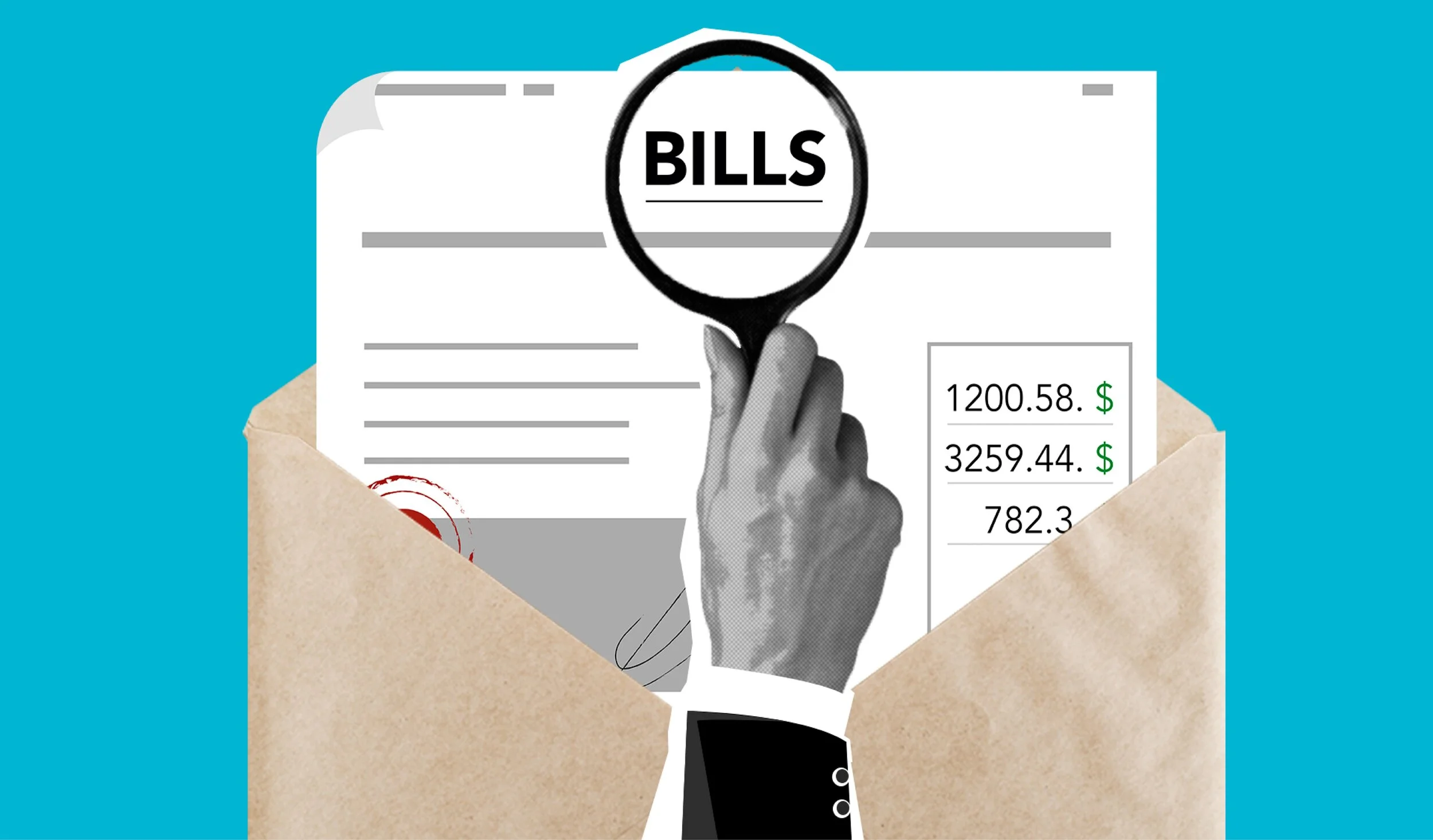
Credit scores, credit reports, loans… it can all be complicated and confusing to understand. Our challenge was to learn the unique experiences of low-income populations and how best to display complex credit information. Our goal was to make it digestible, educational, and hopeful.
Target Audience
Users who self-identified as needing government assistance (such as EBT food stamps) or currently struggled to pay bills
Ages: 25-60+
Any level of education
$0- 30,000
Self-identified as “Unknowledgeable” about credit
My Role
UX researcher alongside additional product designers
My Tools
Miro
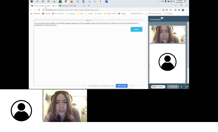
Userlytics
Sketch
Timeline
~12 weeks
“I was completely overwhelmed. I would start working on my credit, but I had to walk away because it was emotional”
What did I do?
I created a research plan to discover and explore insights about low-income users who frequented our client’s services. Based on these findings, I created several research articles (below) and worked alongside product designers to create wireframes. A second set of moderated user interviews were conducted and I also performed a usability test. The final result was a mid-fidelity prototype and research findings presented to the client.
Research Artifacts and Activities:
2 sessions of in-depth interviews (IDIs) approximately 10 interviews at ~30 minutes each
Insights map
Empathy map
Journey map
Competitive analysis
Literature review
Stakeholder design workshop
Sketches and mid-fidelity wireframes
Moderated usability test
While conducting live moderated user interviews, I learned that consumers struggled to connect their full credit picture, including their past credit history, to where it stands today.
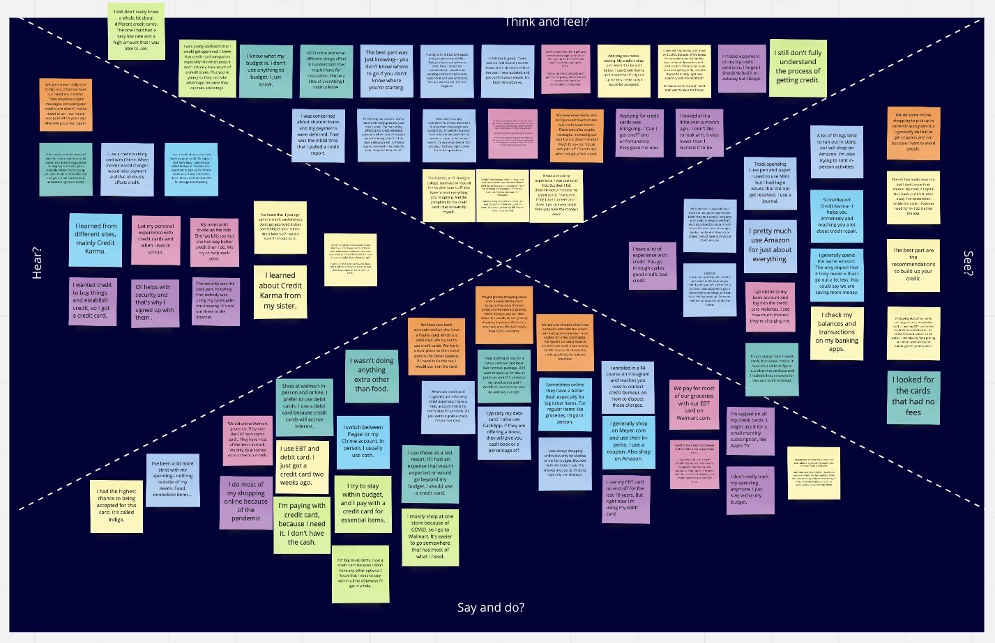
Empathy map of consumers’ feelings, thoughts, pain points, and gains. Note: this image is for visual proof and effect; not necessarily meant to be read as a document.
Why was this important?
Since this client attracts low-income consumers, they are a prime audience for credit education. By understanding their unique experiences and how to meet their needs, it creates a pathway to creating a product that can be expanded to more users. One of our main findings was that simplicity alongside educational tips were key in displaying complicated credit information, and we found this balance to be helpful even for users with more credit knowledge.
How did the research make an impact on the user?
Design choices made as a result of research:
Prioritize a CTAs to resolve crisis (ex: debt management or disputing a charge)
Provide actionable steps/tips/tricks next to their personal data
Keep the information simple, well-organized, and digestible “at a glance”
One of the biggest research insights was the extent of how stressed low-income populations are in the wake of the events in 2020. Users discussed the fears of leaving their homes, the anguish of unemployment, home insecurity… All of the users I spoke to had a great desire to improve their situation, but felt it was an overwhelming process. During the usability test, users said the display softened the learning curve. Additionally, it saved time and energy from having to Google credit lingo back and forth. By removing the barriers and displaying the “need to know” information, the research showed that simplicity quickened their understanding of credit factors.