Unpaid Bills During a Global Crisis
How do we Design for empathy in the wake of a pandemic?
The Context
Our team was working with a client to redesign how they may collect data and payments for users with delinquent (unpaid) accounts. This was an especially sensitive topic since this was during the wake of the COVID-19 pandemic when many users lost their employment or faced financial instability.
Note: I researched some awesome stuff, but I can’t show you everything. Below is a case study that summarizes the research I did with a client.
The Challenge
The client’s priority was to find a way to encourage users to pay off their debts while creating a digital environment that was sensitive to the effects of the pandemic.
Target Audience
Users who have had a delinquent account or a credit card past due. We also wanted to keep the income bracket open, since the client tends to attract an audience from a higher income demographic.
Ages: 25-40
Some college education
$50,000- 200,000+
My Role
UX researcher alongside additional product designers
My Tools
Miro
Userlytics
Sketch
Timeline
~6 weeks
“It really feels like they care, even if it’s just words on a screen.”
What did I do?
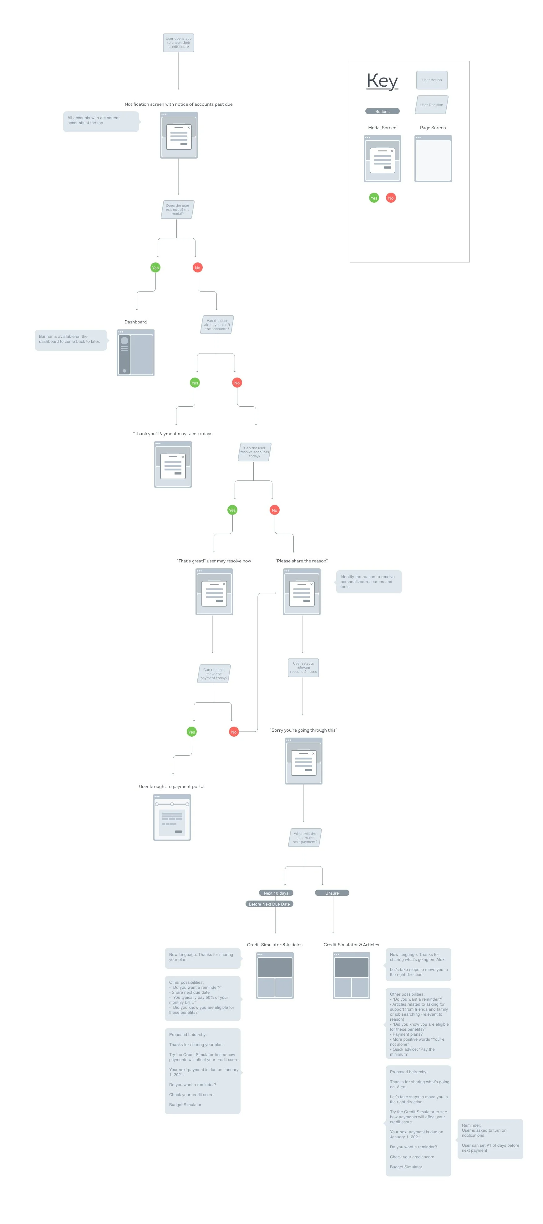
I designed and conducted unmoderated and moderated usability tests for a high-fidelity prototype. We created a web-based experience for users to tell their credit card company why they are late for payments and receive resources to help their situation. A warm and empathic response was prioritized, and we created a pathway for users to make a payment if they were able to do so.
The research concluded that self-service was preferred over speaking with a live customer service rep, so we created a pathway for users to make payments or reasons for lateness without needing to speak with anyone.
Research Artifacts and Activities:
Unmoderated usability test and analysis report
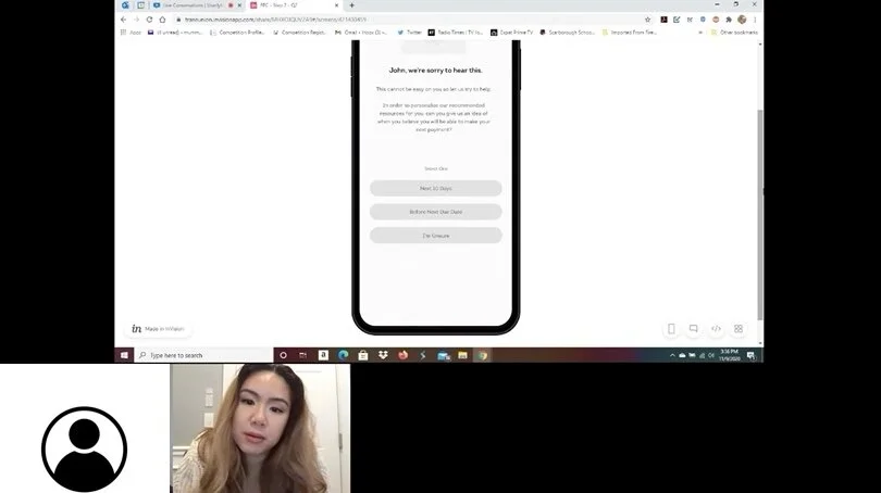
Moderated usability test and analysis report
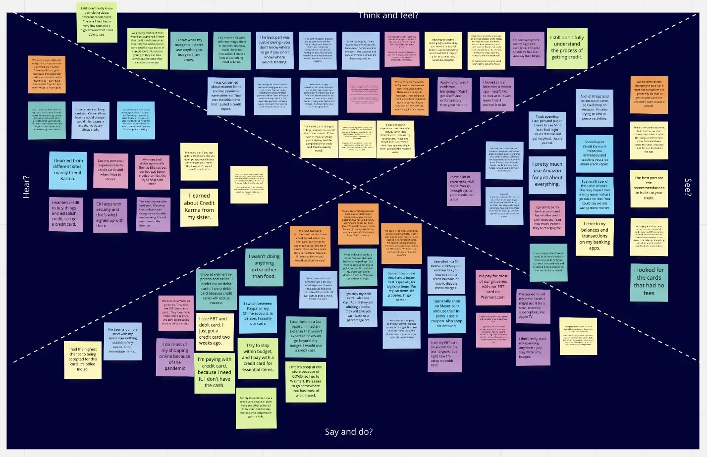
Journey map
Mid-fidelity and high-fidelity wireframes
Stakeholder presentation
Examples of Artifacts:
Why was this important?
When consumers do not pay their credit cards on time, their accounts are eventually sold to collections. This is a situation that financial institutions and customers want to avoid. If we create an experience that encourages consumers to stay on top of their accounts and pay off what they can, it will prevent their accounts from ending up in collections. This also means the client is more likely to receive repayment.
How did the research make an impact on the user?
Design choices made as a result of qualitative research:
Prioritize self-service over calls from customer service
Provide a full view of their credit and financial summary
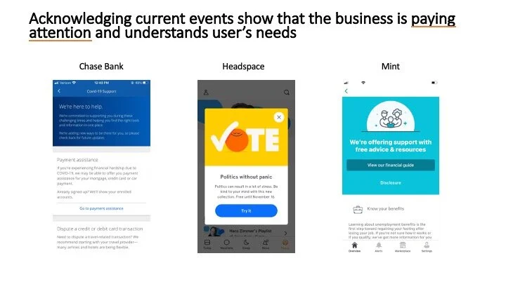
Show users that the company cares about them
Financial struggles can trigger feelings of shame and embarrassment
I learned the extent of this during in-depth interviews with users who have experienced delinquent accounts. Shame can breed lack of action and users could fall even deeper in debt.
Because of these negative emotions, users said they avoid looking at their accounts with late payments. However, by providing a self-service option (no need to talk to a stranger about your situation) and resources to keep themselves up to date, users were better set up for success.
I worked hand-in-hand with product designers to create a full view of the user’s credit summary (which accounts to watch closely, late payments, and paths to make payments on the accounts with the most impact on their credit).
In the end, the most important impact is that users felt like the financial institution actually cared about them. The emotional connection for users are important to keep their motivation to improve their situation. Many times, users missed payments due to emotionally-draining circumstances (divorce, medical issues, job loss, etc.). By showing empathy during this process, it showed users they were not alone and that hope was possible.

